Hourly Temperature Chart
API: Weather API
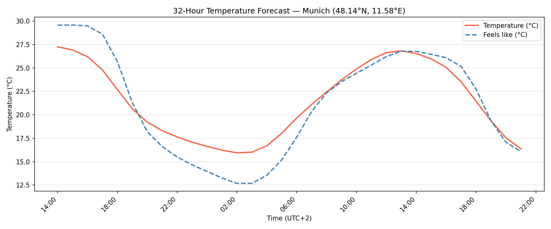
This example demonstrates how to retrieve a 24-hour hourly forecast from the Rainbow Weather API and visualize air temperature alongside the apparent (feels-like) temperature using a filled line chart in Python with matplotlib.
Code Snippet
The code below fetches hourly forecast data for a given location and renders a dual-line chart where:
- The x-axis represents time (UTC) in hourly steps.
- The y-axis represents temperature in °C.
- The shaded area between the two lines highlights the gap between actual and perceived temperature.
temperature_chart.py
import matplotlib.pyplot as plt
import os
import requests

from datetime import datetime, timezone

RAINBOW_API_TOKEN = os.getenv("RAINBOW_API_TOKEN")

# Put your location here (London)
LON = -0.1278
LAT = 51.5074

url = (
    f"https://api.rainbow.ai/weather/v1/forecast/{LON}/{LAT}"
    f"?forecast_hours=24&token={RAINBOW_API_TOKEN}"
)
data = requests.get(url).json()

hourly = data["timelines"]["hourly"]
times = [datetime.fromisoformat(h["startTimeIso"]) for h in hourly]
temperature = [h["temperature"] for h in hourly]
feels_like = [h["feelsLikeTemperature"] for h in hourly]

fig, ax = plt.subplots(figsize=(12, 5))

ax.plot(times, temperature, color="tomato",    linewidth=2, label="Temperature (°C)")
ax.plot(times, feels_like,  color="steelblue", linewidth=2, linestyle="--", label="Feels like (°C)")

ax.set_xlabel("Time")
ax.set_ylabel("Temperature (°C)")
ax.set_title(f"Hourly Temperature Forecast — ({LAT}, {LON})")
ax.xaxis.set_major_formatter(plt.matplotlib.dates.DateFormatter("%H:%M"))
plt.gcf().autofmt_xdate(rotation=45)
ax.legend()
ax.grid(axis="y", alpha=0.3)

plt.tight_layout()
plt.show()
Run
Install dependencies and set your API token:
Bash
pip install matplotlib requests
export RAINBOW_API_TOKEN=<your-api-key>
python temperature_chart.py