7-Day Daily Forecast Chart
API: Weather API
This example demonstrates how to retrieve a 7-day daily forecast from the Rainbow Weather API and render a combined chart showing:
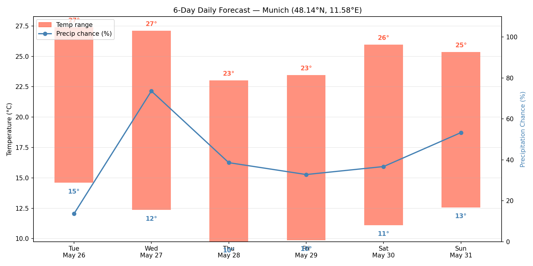
- A temperature range bar per day (min–max span).
- A precipitation chance line on a secondary axis.
This type of chart is common in consumer weather apps — it gives an at-a-glance overview of the week ahead.
Code Snippet
The chart uses a dual-axis layout: the left axis tracks temperature (°C), the right axis tracks precipitation probability (%). Temperature min/max values are annotated directly on each bar.
daily_summary.py
import matplotlib.pyplot as plt
import matplotlib.patches as mpatches
import os
import requests

from datetime import datetime, timezone

RAINBOW_API_TOKEN = os.getenv("RAINBOW_API_TOKEN")

# Put your location here (London)
LON = -0.1278
LAT = 51.5074

url = (
    f"https://api.rainbow.ai/weather/v1/forecast/{LON}/{LAT}"
    f"?forecast_days=7&token={RAINBOW_API_TOKEN}"
)
data = requests.get(url).json()

daily = data["timelines"]["daily"]
labels = [datetime.fromisoformat(d["startTimeIso"]).strftime("%a\n%b %d") for d in daily]
temp_min = [d["temperatureMin"] for d in daily]
temp_max = [d["temperatureMax"] for d in daily]
precip_chance = [d["precipitationChance"] for d in daily]

x = range(len(daily))

fig, ax1 = plt.subplots(figsize=(12, 6))

# Temperature range bars
bar_width = 0.5
bars = ax1.bar(x, [mx - mn for mx, mn in zip(temp_max, temp_min)],
               bottom=temp_min, width=bar_width,
               color="tomato", alpha=0.7, label="Temp range (°C)")

for i, (mn, mx) in enumerate(zip(temp_min, temp_max)):
    ax1.text(i, mn - 0.8, f"{mn:.0f}°", ha="center", va="top", fontsize=9, color="steelblue")
    ax1.text(i, mx + 0.3, f"{mx:.0f}°", ha="center", va="bottom", fontsize=9, color="tomato")

ax1.set_ylabel("Temperature (°C)")
ax1.set_xticks(list(x))
ax1.set_xticklabels(labels)
ax1.grid(axis="y", alpha=0.3)

# Precipitation chance line on secondary axis
ax2 = ax1.twinx()
ax2.plot(list(x), precip_chance, color="steelblue", linewidth=2,
         marker="o", markersize=5, label="Precip chance (%)")
ax2.set_ylabel("Precipitation Chance (%)")
ax2.set_ylim(0, 110)
ax2.yaxis.label.set_color("steelblue")

ax1.set_title(f"7-Day Daily Forecast — ({LAT}, {LON})")

lines = [
    mpatches.Patch(color="tomato", alpha=0.7, label="Temp range"),
    plt.Line2D([0], [0], color="steelblue", linewidth=2, marker="o", label="Precip chance (%)"),
]
ax1.legend(handles=lines, loc="upper left")

plt.tight_layout()
plt.show()
Run
Install dependencies and set your API token:
Bash
pip install matplotlib requests
export RAINBOW_API_TOKEN=<your-api-key>
python daily_summary.py